Death By A Thousand Cuts
Play the song while looking at the posters to get the full effect!
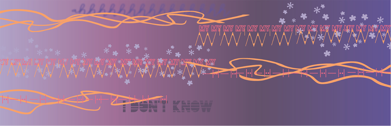
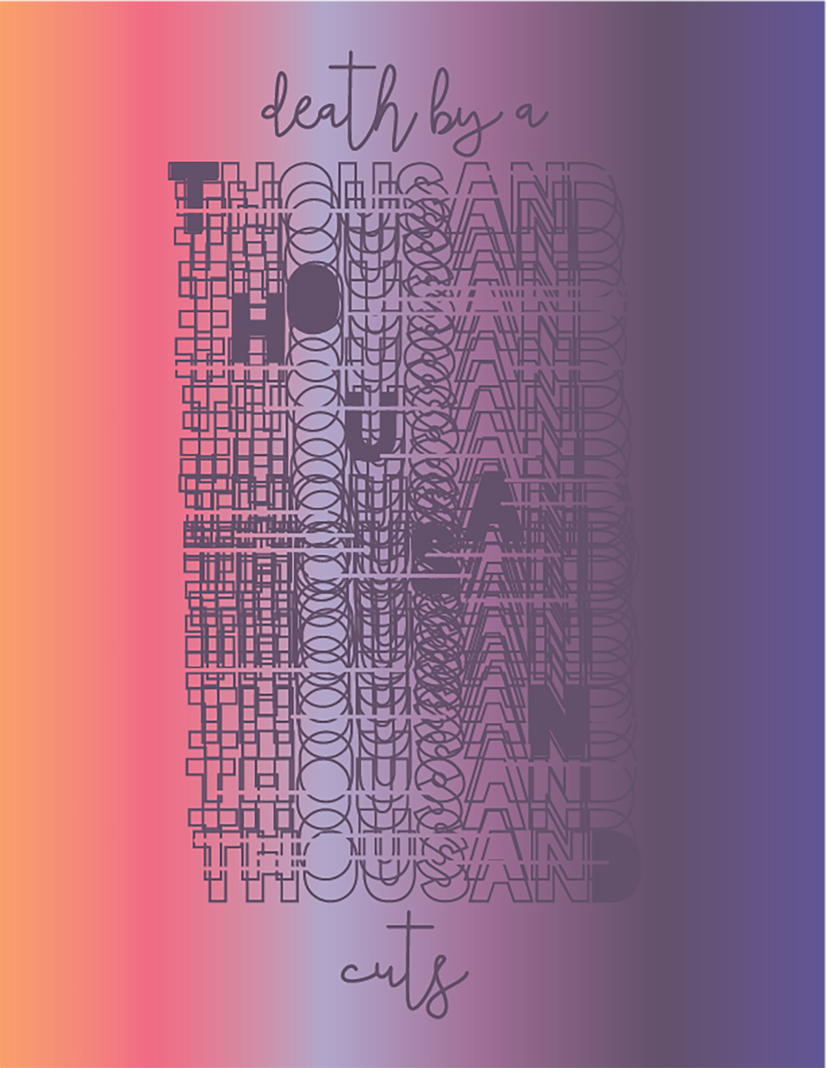
The goal was to create 3 panels that portray the concept, rhythm, and melody of a song using only typographic elements. I chose to portray ‘Death by a Thousand Cuts’ by Taylor Swift. I chose the last 49 seconds of the song because it captures the heart of the whole song. The first panel portrays the concept of the song by having cut marks through the words and thousand listed numerous times in dark purple to literally portray a thousand as well as the heaviness of the lyrics. The second panel portrays the melody. Each collection of colored squares is the musical chord played at that time in the song with the lyrics aligned to the chords. The last panel portrays rythm. Different shapes represent different instrumemts you hear through out the song. Overall the three panels are tied together with the light to dark color schemed and cuts made into the words, holding the concept through all panels.
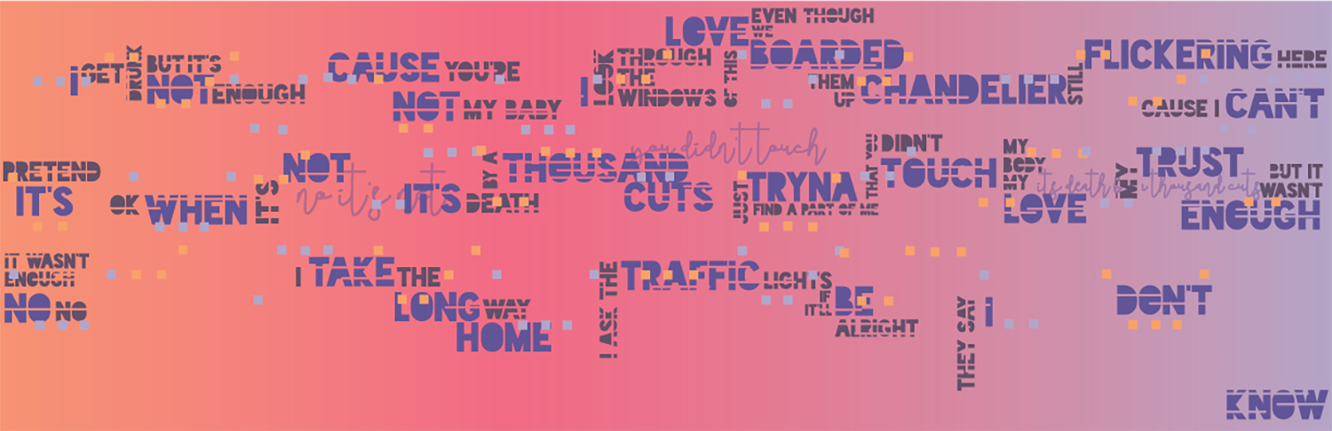
Despite the sorrowful meaning behind the lyrics the song still has a light, magical feel to it. Because of this I chose a color palette based off a sunset. I chose bright pink and orange colors to represent the happy feeling combined with heavy purples of nightfall to represent the heavier meaning of the song. I chose “Blackface” as the main typeface using “Sunrise” and “Midnight” from it. These fonts have a funky side to them yet also have a heavy feel and the ability to repeat and look blurred which is an element I envisioned from the song. The secondary font is “Classico” which I chose because the handwritten script plays into the magical feel of the song, it also allowed for room to create illustrations from the type. The last font used is “Accent-Normal” to create the drum beat in the third panel. The thick and thin parts of this font combined both Blackface and Classico together.